

Time Series: Air revenue passenger prediction
Overview
Under this project scope we will forecast monthly air passenger revenue using time series techniques.
Time series is useful method in machine learning when we need to forecast a value given a time component: an information about the time period previous values were recorded.
Jupyter Notebook for current project can be found here.
Data: series sourced form "Federal reserve economic data" via Quandl API:
https://www.quandl.com/data/FRED/AIRRPMTSI-Air-Revenue-Passenger-Miles.
Observations include monthly air revenue starting from 2000 to present.
Import libraries
For this project we will need Quandl limbrary to retreive the data and statsmodels,api to work with statistical models. Throughout the analysis, we will visualize results with matplotlib and plotly libraries.
Python code
import quandl # use quandl linbrary to retreive the data

"""
- will use pandas and numpy for data manipulation and calculus
- import datetime to work with datetime type
- use Series library to work with time series

"""
import pandas as pd
import numpy as np
from datetime import datetime
from pandas import Series

import matplotlib.pyplot as plt
%pylab inline
plt.style.use('seaborn-whitegrid')

# will ignore the warnings
import warnings
warnings.filterwarnings("ignore")

"""
- to work with statistical models we statsmodels.api and stats module from scipy
- use itertools and seasonal_decompose for data preparation and model building
- to plot PACF/ACF chart use tsaplots graphic module

"""
from scipy import stats
import statsmodels.api as sm
import statsmodels.tsa.api as smt
from statsmodels.tsa.api import Holt

import itertools
from itertools import product
from statsmodels.tsa.seasonal import seasonal_decompose # perform seasonal decomposition

from statsmodels.graphics.tsaplots import plot_acf
from statsmodels.graphics.tsaplots import plot_pacf

"""
- visualize results using plotly library, connected to current notebook

"""
from plotly.offline import download_plotlyjs, init_notebook_mode, plot, iplot
import plotly
import plotly.graph_objs as go

init_notebook_mode(connected=True)
Data processing and EDA
To retreive data from source, we opearte .get() function, using token and dataset reference.
Python code
authtoken = "XXXXXX"
df = quandl.get("FRED/AIRRPMTSI", authtoken=authtoken)
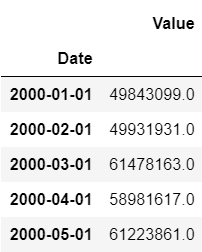
df.head() # show how the data looks like
In practice it's not necessary to use the entire time series. To provide precise analysis we are going to use date range from 2010-01-01 to 2018-09-01.
Python code
df=df['2010-01-01':'2018-09-01']

# plot values from range
fig, ax = plt.subplots(figsize=(15,7)) # setting up size
df.Value.plot() # graph plot
plt.ylabel('Value')
plt.title('Monthly air revenue')
plt.show()
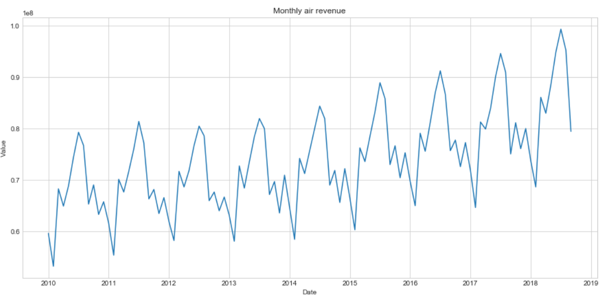
Stationarity test
We see our series are characterized by systematically repeating cycles. To gain high performance of predictions we need to make them stationary to build and apply models afterwards. Then, we start with series decomposition using seasonal component and Dickey-Fuller stationarity test.
Python code
"""
- plot decomposed series, display Dickey-Fuller criteria applying .adfuller() function
"""
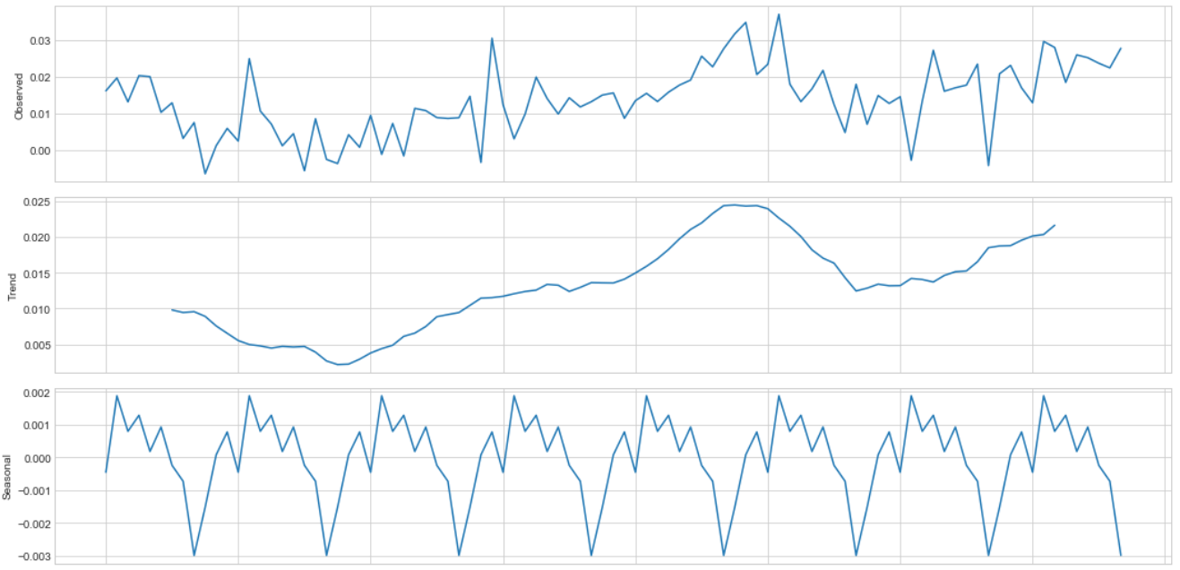
plt.figure(figsize(15,10))
sm.tsa.seasonal_decompose(df.Value).plot()
print "Dickey-Fuller criteria: p=%f" % sm.tsa.stattools.adfuller(df.Value)[1]
Dickey-Fuller criteria: p=0.999088
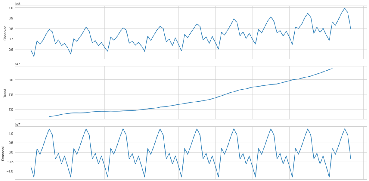
The high coefficient value for Dickey-Fuller criteria proves non-stationarity on 5% significance level.
The residuals and seasonality for decomposed series have a systematic character.
Dispersion stabilization
Additionally we are able to apply Box-Cox power transformation in order to reach higher dispersion stability.
Python code
"""
- create additional column of tranformed values using Box-Cox method
- apply Dickey-Fuller test for transformed values
"""
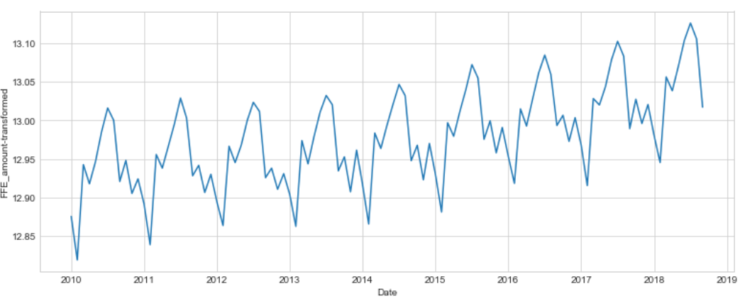
df['Value_t'], lam=stats.boxcox(df['Value'])
plt.figure(figsize(13,5))
df['Value_t'].plot()
plt.ylabel(u'FFE_amount-transformed')
print "lambda-optimum: %f" % lam
print "Dickey-Fuller criteria: p=%f" % sm.tsa.stattools.adfuller(df['Value_t'])[1]
lambda-optimum: -0.039101
Dickey-Fuller criteria: p=0.999030
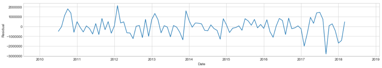
Differencing
Whereas the With Box-Cox transformation applied supposed to result stationary process based on Dickey-Fuller criteria, we still can observe non-ramdomized cycles in time series.
To avoid systematic flactuations, we can try differencing operation.
Python code
"""
- applying 12 order differencing, we reduce data
- however, this operation will improve the stationarity ratio

"""

df['diff'] = df.Value_t.diff(12)
plt.figure(figsize(15,10))
sm.tsa.seasonal_decompose(df['diff'][12:]).plot()
print "Dickey-Fuller criteria: p=%f" % sm.tsa.stattools.adfuller(df['diff'][12:])[1]
Dickey-Fuller criteria: p=0.599792

Based on Dickey-Fuller criteria we can't prove stationarity, but we are able to make differencing for new series.
Python code
df['diff2'] = df['diff'].diff(1)
pyplot.plot(df['diff2'])
pyplot.show()
print("Dickey-Fuller criteria: p=%f" % sm.tsa.stattools.adfuller(df['diff2'][13:])[1])
Dickey-Fuller criteria: p=0.000324
The resulted series can be categorized as stationary and described more like noise process, that can allow us to prepare model.
Before model fitting, represent the autocorrelation function (ACF) and partial autocorrelation function (PCF) plots.
AR model for lagged values estimation
Let's fit Autoregressive model to establish the optimum number of lagged values.
We will use transformed values since only stationary series could be passed in model.
Python code
"""
- shift 13 orders, since differencing was applied
- autoregression package is already implemented in statmodels as AR()
- order selection wil be based on AIC (Akaike criterion)

"""
data=df['diff2'][13:]
model=smt.AR(data)
order=smt.AR(data).select_order(ic='aic', maxlag=25)

print 'Best lag order = {}'.format(order)
Best lag order = 8
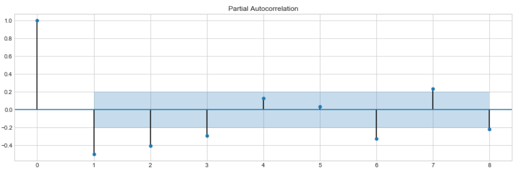
Given best lag order we are ready to visualize the autocorrelation/partial autocorrelation with ACF and PACF plots.
Python code
plt.figure()
plt.subplot(211)

plot_acf(df['diff2'][13:], ax=plt.gca(), lags=8)
pyplot.subplot(212)
plot_pacf(df['diff2'][13:], ax=plt.gca(), lags=8)
pyplot.show()
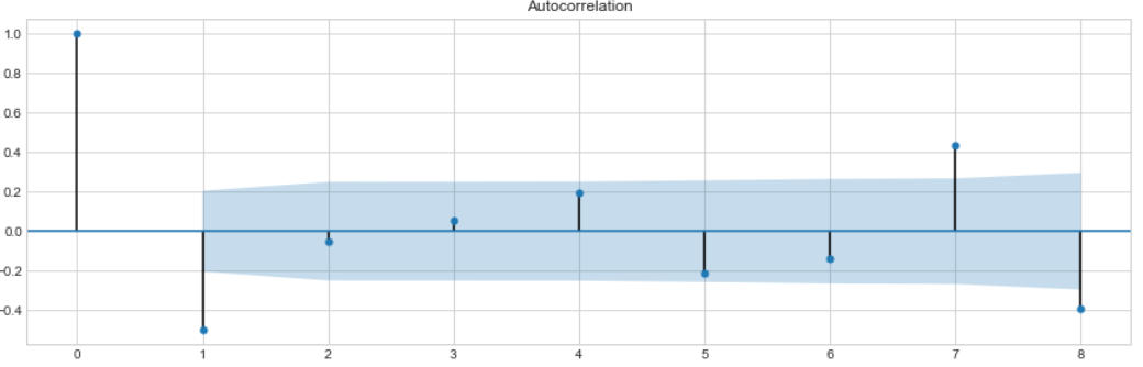
ACF plots display correlation between series and its lags and supposed to help in determining the order of the MA (q) model.
Partial autocorrelation plots (PACF), as the name suggests, display correlation between a variable and its lags that is not explained by previous lags. PACF plots are useful to set up the order of the AR(p) model.
Model selection
Before the model fitting the train/test split is preffered.
For a test sample the last 15 observations (15 months, 14%) will be suitable.
train=df[:'2017-06-01']
test=df['2017-07-01':]
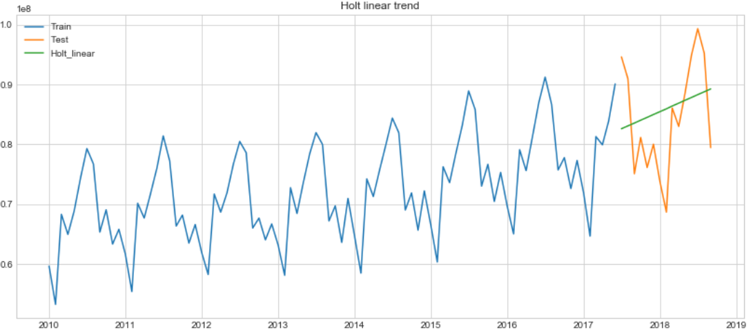
Holt-Winter's model
We can start from building Holt-Winter's model with exponental smoothing, adding trend component.
Python code
holt = Holt(np.asarray(train['Value'])).fit(smoothing_level = 0.3,smoothing_slope = 0.1)
test['Holt_linear'] = holt.forecast(len(test))

plt.figure(figsize=(14,6))
plt.plot(train['Value'], label='Train')
plt.plot(test['Value'], label='Test')
plt.plot(test['Holt_linear'], label='Holt_linear')
plt.title('Holt linear trend')
plt.legend(loc='best')
plt.show()
ARIMA: parameters selection
SARIMAX implenetation allows us to test range of parameters such as trend, seasonal component and noise for best model performance in the same way as "grid-search" does.
The PACF graph represents 3 last lag value significantly different from zero. The value of $p$ could be chosen as $3$.
For $q$ value ACF represnts the first lag only as a considerable non-zero value, but in order to select the best from the range of models, its possible to fit SARIMAX with larger value, for instance, q from range(0,3).
Seasonal component $D=1$ and difference parameter $d=1$.
Parameters Q and P will be selected based on best model from range.
Python code
"""
- since we need to fit model with all possible combinations
we use product of parameters lists

"""

P = range(0, 2)
Q = range(0, 2)
p = range(0, 3)
q = range(0, 3)

a = list(itertools.product(p, Q, p, q))

"""
- will add results of modeling to list based on AIC criterion

"""
best_aic = float("inf")
warnings.filterwarnings('ignore')

for param in a:
   try:
       model=sm.tsa.statespace.SARIMAX(train.Value_t, order=(param[2], 1, param[3]),
                                       seasonal_order=(param[0], 1, param[1], 12)).fit(disp=-1)
   except ValueError:
       print('wrong parameters:', param)
       continue
   aic = model.aic
   if aic < best_aic:
       best_model = model
       best_aic = aic
       best_param = param

warnings.filterwarnings('default')

best_model.summary()
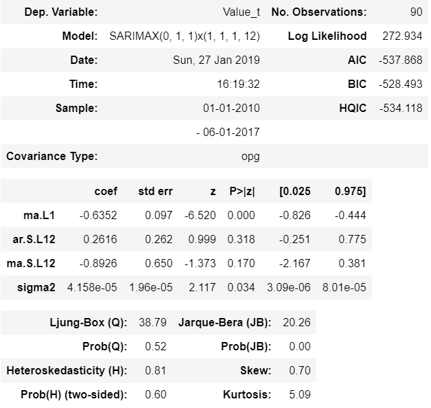
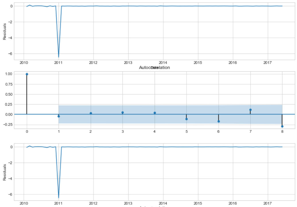
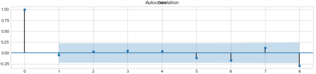
Ljung-Box criteria testifies that residuals are not autocorrelated with high significance level.
Autocorrelation plot presents the only outlier, that was not considered by model. In general, resuduals are converged around zero. Considerable difference is not orbserved on seasonal lags.
Python code
"""
- .plot_acf() to visualize the residuals partial autocorrelation for best model

"""

plt.figure(figsize(13,6))
plt.subplot(211)
best_model.resid[1:].plot()
plt.ylabel(u'Residuals')

ax = plt.subplot(212)
sm.graphics.tsa.plot_acf(best_model.resid[13:].values.squeeze(), lags=8, ax=ax)
Student citeria does not reject the hypothesis of unbiased estimation, while Dickey-Fuller rejects the hypothesis of non-stationarity.
Python code
# use ttest_1samp for student criterion
print "Student criteria: p=%f" % stats.ttest_1samp(best_model.resid[13:], 0)[1]
print "Dickey-Fuller criteria: p=%f" % sm.tsa.stattools.adfuller(best_model.resid[13:])[1]
Student criteria: p=0.953890
Dickey-Fuller criteria: p=0.000000
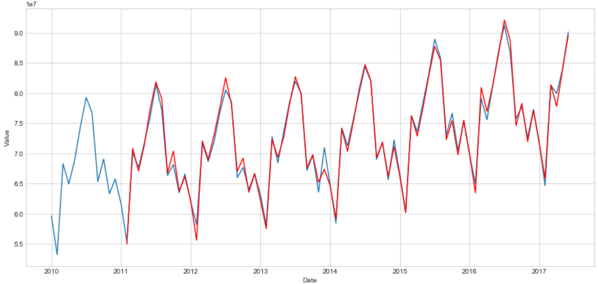
Define the reverse procudere for Box-Cox transformation below, applying to train sample. Then, we will plot train predictions, overlaped by true values to compare the modelling result with expected series.
Python code
"""
- function will return transformation based on given lambda:
- exp transformation for lambda=0;
- inverse log transformation if lambda<>0

"""
def invboxcox(y,lam):
   if lam == 0:
       return(np.exp(y))
   else:
       return(np.exp(np.log(lam*y+1)/lam))

train['Value_new'] = invboxcox(best_model.fittedvalues, lam)
plt.figure(figsize(15,7))
train.Value.plot()
train.Value_new[13:].plot(color='r')
plt.ylabel('Value')
pylab.show()
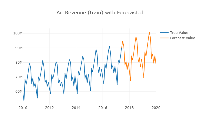
Evaluating predictions
On the next step we evaluate predictions on test and plot result combind with train data set.
Python code
"""
- make predictions, inversely transform and add to data frame
- combine historical values with forecasted to display on graph

"""

l=invboxcox(best_model.predict(start=89, end=120), lam)
l=l.to_frame()
l=l.rename(columns={0: 'Forecast'})
test=test.rename(columns={"Value": 'Test_value'})

df2=train[['Value']]
# concat train and forecast frames for plotting
df2 = pd.concat([df2, l])

"""
- combine true  data and forcasted values in one figure
- plot figure inside notebook with connection mode on

"""

data1 = go.Scatter(
         x=df.index,
         y=df2['Value'],
   name='True Value')

data2 = go.Scatter(
         x=l.index,
         y=l['Forecast'],
name='Forecast Value')

data= [data1, data2]
layout = {'title': 'Air Revenue (train) with Forecasted'}
fig=go.Figure(data=data, layout=layout)

iplot(fig, show_link=False)
Forecat Accuracy Evaluation
To evaluate model performace, we are going to estimate mean squared and mean absolute errors and plot forecasted values over the test sample.
Python code
"""
- display forecatsted and test values by red and green respectively

"""

plt.figure(figsize=(10, 7))
plt.plot(df2['Value'], 'b-')
plt.plot(l['Forecast'][:'2018-11-05'], 'r-')
plt.plot(test['Test_value'], 'g-')
plt.legend(); plt.xlabel('Date'); plt.ylabel('Air Revenue')
plt.title('Air Revenue: entire samle with Forecasted')
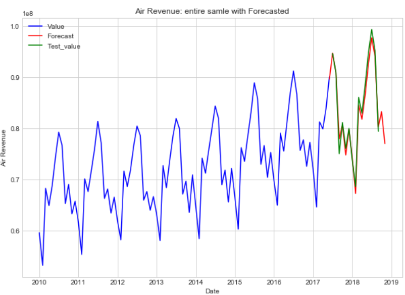
Estimate MSE and MAE on test:
Python code
# mean squared value on test
mse = ((l['2017-07-01':'2018-09-01']['Forecast'] - test['2017-07-01':'2018-09-01']['Test_value']) ** 2).mean()
print('The Mean Squared Error of forecasts is {}'.format(round(mse, 2)))

# mean absolute value on test
mae = (l['2017-07-01':'2018-09-01']['Forecast'] - test['2017-07-01':'2018-09-01']['Test_value']).mean()
print('The Mean Absolute Error of forecasts is {}'.format(round(mae, 2)))
The Mean Squared Error of forecast is 1.96499098925e+12
The Mean Absolute Error of forecast is -578170.27
References:
- https://www.coursera.org/lecture/data-analysis-applications/vriemiennyie-riady-EjNEV
- https://otexts.com/fpp2/
- http://www.iosrjournals.org/iosr-jm/papers/vol1-issue3/C0131020.pdf
- https://www.statsmodels.org/dev/generated/statsmodels.tsa.ar_model.AR.select_order.html