

Taxi Fare Predictions - Google BigQuery Data (Part 1)
Introduction
For this project we are going to use Google BigQuery data to predict the estimated fare amount of New York taxi rides. We aim to manipulate the dataset, prepare exploratory analysis, retreiving all the hidden patterns and variables relationships for creating machine learning models to offer expected fare. The major part is consentrated on data cleaning, visual component and fetaure engineering. Jupyter notebook for current project is available via the link
The Data:
The data was collcted via Google BigQuery from "NYC TLC Trips" public dataset and contains information about NYC taxi trips details:
- Pickup longitude/latitude;
- Dropoff longitude/latitude;
- Pickup/dropoff time;
- Passenger count;
- Trip distance;
- Fare amount.
We will retrieve 2015 year data and load 2 millions rows into dataframe.
Libraries import
First we need to import all libraries we will use to manipulate dataframe, visualize results and make predictions.
Python code
"""
- gbq - load BigQuery data
- pandas, matplotlib, numpy - for data manipulation
- seaborn - data visualization

"""
import pandas as pd
import seaborn as sns
import matplotlib.pyplot as plt
import numpy as np
from pandas.io import gbq
import boto3 # transfer file with data to S3 cloud
%matplotlib inline

"""
- dateteme module for time type convertation
- we will use math modules to derive the custom distance feature based on radians

"""
import datetime as dt
from math import sin, cos, sqrt, atan2, radians
from scipy import stats
from sklearn.utils import shuffle

"""
- import Plotly modules for interactive data visualization
- connect to plot inside notebook

"""

from plotly.offline import download_plotlyjs, init_notebook_mode, plot, iplot
import plotly.plotly as py
import plotly.graph_objs as go

init_notebook_mode(connected=True)

"""
- sklearn for model building and performance validation

"""

from sklearn.model_selection import train_test_split
from sklearn import linear_model
from sklearn.metrics import mean_absolute_error

from sklearn.linear_model import LinearRegression
from sklearn.linear_model import Lasso
from sklearn import ensemble
from sklearn.ensemble import RandomForestRegressor
import xgboost as xgb
Data processing
Step №1 - Data retrieving
We start with collection data from Google BigQuery public dataset and writing this into .csv file. Optionally we will store the file on AWS cloud.
Python code
"""
- loading data from big query project, write into frame
- automatically upload csv file to S3 storage
"""
df = gbq.read_gbq('SELECT * FROM taxi.taxi_fare_2015 LIMIT 2000000', project_id='XXXXXXX')
df.to_csv('fares_all.csv')
ACCESS_ID = 'XXXXXX'
ACCESS_KEY='XXXXXX'
filename = 'fares_all.csv'
bucket_name = 'storagebucketmachinelearning'
s3 = boto3.client('s3', aws_access_key_id=ACCESS_ID,
aws_secret_access_key= ACCESS_KEY)
s3.upload_file(filename, bucket_name, filename)
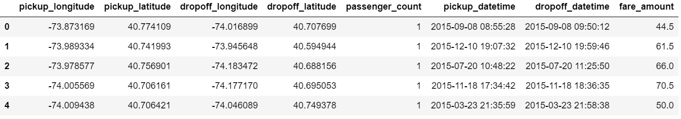
# select the columns we need
cols=['pickup_longitude', 'pickup_latitude', 'dropoff_longitude', 'dropoff_latitude',
'passenger_count', 'pickup_datetime', 'dropoff_datetime', 'fare_amount']
df=df[cols]
Resulted dataframe is presented below:
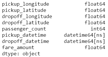
Step №2 - Primary data cleaning
Next we will drop NaN values from dataframe and make sure that our target variable, "fare amount", takes postive values. Note, that some varibales, such as pickup or dropoff datetime should be converted into timestamp.
Python code
"""
- drop rows with negative and zero fare amount
- drop NaN values

"""
df=df[df['fare_amount']>0]
df=df.dropna(how='any')
df.isna().any()

"""
- apply the date type transformation for pickups/dropoffs

"""
df['pickup_datetime'] = df['pickup_datetime'].apply(lambda x: dt.datetime.strptime(x, '%Y-%m-%d %H:%M:%S'))
df['dropoff_datetime'] = df['dropoff_datetime'].apply(lambda x: dt.datetime.strptime(x, '%Y-%m-%d %H:%M:%S'))
Now let's look at results of timestamp transformation:
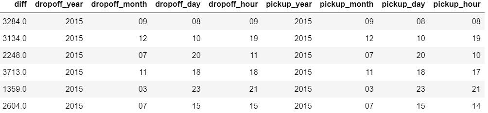
Step №3 - Features engineering
The further steps will be to calculate the difference in seconds and create new column for taxi trips duration - "diff".
Besides we are going to derive time periods from stamps for both dropoffs and pickups. These variables will be used for further hypothesis testing and models fitting.
Python code
"""
- convert the diff columns into 'float' type

"""
df['diff'] = df['dropoff_datetime'] - df['pickup_datetime']
df['diff'] = df['diff'].astype('timedelta64[s]')

"""
- create a separate column for each period of time, when dropoff/pickup was occured

"""
df['dropoff_year'] = [x.strftime('%Y')for x in df['dropoff_datetime']]
df['dropoff_month'] = [x.strftime('%m')for x in df['dropoff_datetime']]
df['dropoff_day'] = [x.strftime('%d')for x in df['dropoff_datetime']]
df['dropoff_hour'] = [x.strftime('%H')for x in df['dropoff_datetime']]


df['pickup_year'] = [x.strftime('%Y')for x in df['pickup_datetime']]
df['pickup_month'] = [x.strftime('%m')for x in df['pickup_datetime']]
df['pickup_day'] = [x.strftime('%d')for x in df['pickup_datetime']]
df['pickup_hour'] = [x.strftime('%H')for x in df['pickup_datetime']]
Display how the new features look like:
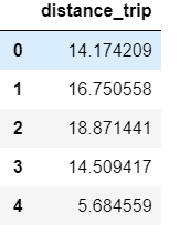
The distance between pickup and dropoff points can also be highly useful for our analysis. To estimate the distance we will apply Haversine formula based on radians and add related column to a dataframe as "distance_trip" variable.
Python code
"""
- difine an approxiamte earth radius in km
- write a function to convert longitude/latitude to radians and return km distance from formula

"""

R=6373.0
def distance(lon1, lat1, lon2, lat2):
   lon1, lat1, lon2, lat2 = map(np.radians, [lon1, lat1, lon2, lat2])
   # estimate the distance between dropoff (lon2, lat2) and pickup (lon1, lat1)
   dlon = lon2 - lon1
   dlat = lat2 - lat1

   a = np.sin(dlat/2.0)**2 + np.cos(lat1) * np.cos(lat2) * np.sin(dlon/2.0)**2

   c = 2 * np.arcsin(np.sqrt(a))
   km = 6367 * c
   return km

# adding a column to dataframe
df['distance_trip'] = distance(df['pickup_longitude'], df['pickup_latitude'],
                              df['dropoff_longitude'], df['dropoff_latitude'])
Note, that calculated distance is presented in kilometers and has a float type:
Step №4 - Outliers detection
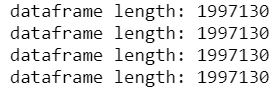
On the next step we continue data cleaning with outliers check. Below we investigate the risk of incorrect spatial data - all coordinates pairs should be limited by boundaries: [-90, 90] for latitude and [-180, 180] for longitude.
Python code
"""
- initialize the interval for latitude/longitude
- check if dataframe contains values out of boundaries, display the length

"""

lat_range=[-90,90]
long_range=[-180,180]

# pickups check
print "dataframe length: "+ str(len(df[(df['pickup_latitude']> lat_range[0]) | (df['pickup_latitude']< lat_range[1])]))
print "dataframe length: "+ str(len(df[(df['pickup_longitude']> long_range[0]) | (df['pickup_longitude']< long_range[1])]))
# dropoffs check
print "dataframe length: "+ str(len(df[(df['dropoff_latitude']> lat_range[0]) | (df['dropoff_latitude']< lat_range[1])]))
print "dataframe length: "+ str(len(df[(df['dropoff_longitude']> long_range[0]) | (df['dropoff_longitude']< long_range[1])]))
All pairs of coordinates lie inside of corresponding intervals.
Apart from data correctness check the useful option will be to remove extreme points for distance, duration and fare amount variables. This operation will reduce the variance and take out potential outliers from data.
Python code
"""
- we will use numpy .percentile function to calculate first and third quartile
- next calculate interquartile interval
- set up the boundaries for extremely small and large values
- return the frame inside interval

"""
def remove_outliers(df, column):
   quartile_1, quartile_3 = np.percentile(df[column], [25, 75])
   iqr = quartile_3 - quartile_1
   min = quartile_1 - (iqr * 1.5)
   max = quartile_3 + (iqr * 1.5)

   df = df[(df[column] <= max) & (df[column] >= min)]
   return df

"""
- apply function for duration, distance and fare amount

"""
data=remove_outliers(df, 'distance_trip')
data=remove_outliers(data, 'fare_amount')
data=remove_outliers(data, 'diff')
The final note will be dropping the observetions where passengers count is more than 6. In this work we will consider the taxies that can carry up to 6 passangers only.
Python code
data=data[data['passenger_count']<=6]
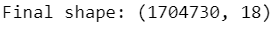
print 'Final shape: '+str(data.shape)
After data processing steps above we see the dataframe has 1 704 730 rows and 18 features.
Explanatory data analysis
Before explanatory analysis start we list down a number of hypothesis as factors affecting the taxi rides cost:
- Fare amount-distance trip relationship: the longer the distance the higher taxi fare to pay;
- Trip duration effect: the trips with higher duration will cost more;
- Pickup time period - high taxi fares for peak hours;
- Pickup day - the fare amount can differ depends on day;
- Pickup neighborhood - the fare amount can flactuate depending on location.
Step №1 - Fare amount - distance trip
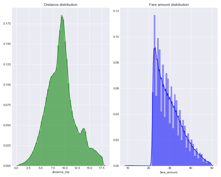
Starting with plotting distribution chart for distance and fare amount, we can investigate the form similar to stepwise and left tail for fare amount. However, the distribution peak reached between amount of 20 and 30.
In comparison, distance distribution presented much smoother.
Python code
# set seaborn style with dark grid
plt.style.use('seaborn-darkgrid')

"""
- combine the distplots in one figure, customize the size

"""
f = plt.subplots(2,2,figsize=(10,8))
plt.subplot(1, 2, 1)
sns.distplot(data['distance_trip'], kde=True, color="g", kde_kws={"shade": True}, label = 'trip-distance')
plt.title('Distance distribution')

plt.subplot(1, 2, 2)
sns.distplot(data['fare_amount'], kde=True, color="b", kde_kws={"shade": True}, label = 'fare-amount')
plt.title('Fare amount distribution')

plt.tight_layout()
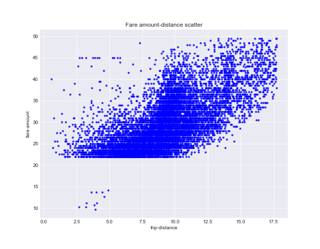
To illustrate relationship between variables graphically we draw a sample of 10000 points from entire frame. The correlation between fare amount and distance seems considerable (0.67), the large number of points on scatter located along the main diagonal.
Python code
"""
- shuffle datframe, take the portion of 10000 rows
- use .corr() method to compute Pearson r for two variables in entire dataframe

"""

sample = shuffle(data)[0:10000]
# Create the plot object
fig, ax = plt.subplots(figsize=(9,7))

# Plot the data, set the size (s), color and transparency (alpha)
# of the points
ax.scatter(sample['distance_trip'], sample['fare_amount'], s = 10, color = 'b', alpha = 0.75)


# Label the axes and provide a title
ax.set_title('Fare amount-distance scatter')
ax.set_xlabel('trip-distance')
ax.set_ylabel('fare-amount')
print 'Pearson correlation: '+ str(round(data['fare_amount'].corr(data['distance_trip']),2))

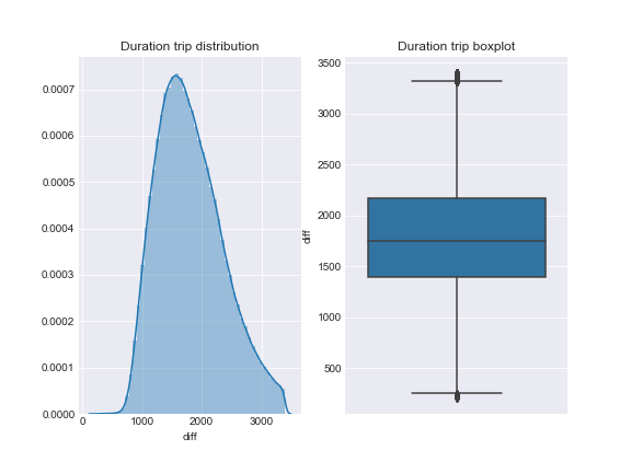
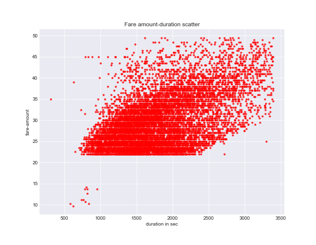
Step №2 - Fare amount - duration
Duration trip distribution looks quite smooth and not significantly affected by outliers. Nonetheless the correlation between duration and fare amount is not such strong (0.51).
Python code
f = plt.subplots(2,2,figsize=(8,6))
plt.figure(1)
plt.subplot(121)
sns.distplot(data['diff'])
plt.title('Duration trip distribution')

# create seaborn boxplot
plt.subplot(122)
sns.boxplot(y=data['diff'])
plt.title('Duration trip boxplot')

plt.show()
Python code
"""
- estimated Pearson R displayed lower correlation between fare and duration

"""

fig, ax = plt.subplots(figsize=(9,7))

ax.scatter(sample['diff'], sample['fare_amount'], s = 10, color = 'r', alpha = 0.75)

ax.set_title('Fare amount-duration scatter')
ax.set_xlabel('duration in sec')
ax.set_ylabel('fare-amount')
print 'Pearson correlation: '+ str(round(data['fare_amount'].corr(data['diff']),2))

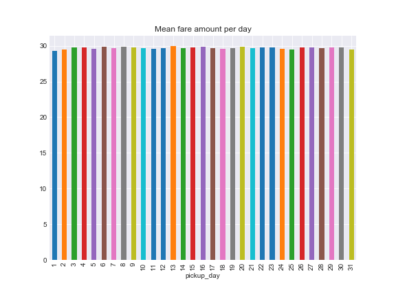
Step №3 - Time period effect
The further step will be to analyze the fare amount changes over the time. As we can observe from plot below, taxi costs remain stable on average over days.
Python code
"""
- groupby data by pickup day and estimate the mean

"""
fig, ax = plt.subplots(figsize=(8,6))
data.groupby('pickup_day')['fare_amount'].mean().plot.bar()
ax.set_title('Mean fare amount per day')
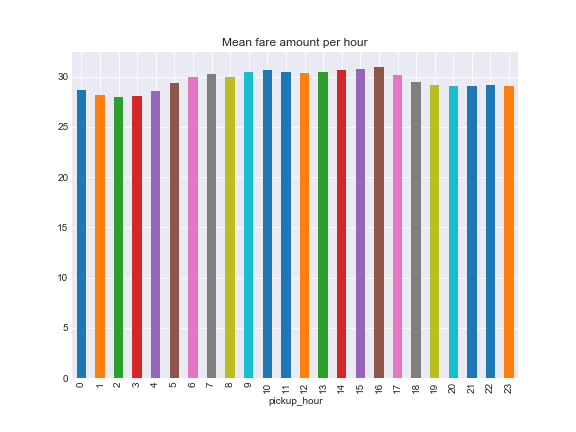
Over hours fare amount reaches its peak at 16:00 and slightly goes down till 21:00, while the lowest fare mean observed at 02:00.
Python code
"""
- grouping per hour with mean estimated

"""
fig, ax = plt.subplots(figsize=(8,6))

data.groupby('pickup_hour')['fare_amount'].mean().plot.bar()
ax.set_title('Mean fare amount per hour')
plt.show()
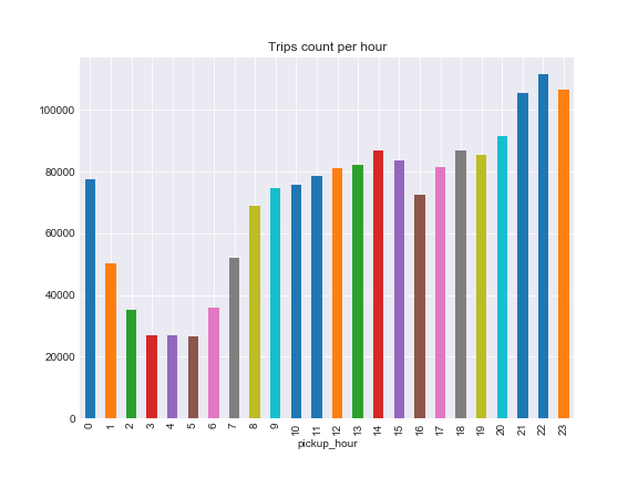
However, the total rides count per hour presents minumum between 3:00 and 5:00 and hits maximum at 22:00.
Python code
"""
- we use count() method to compute the total rides with respect of hour

"""
fig, ax = plt.subplots(figsize=(8,6))
data.groupby('pickup_hour')['fare_amount'].count().plot.bar()
ax.set_title('Trips count per hour')
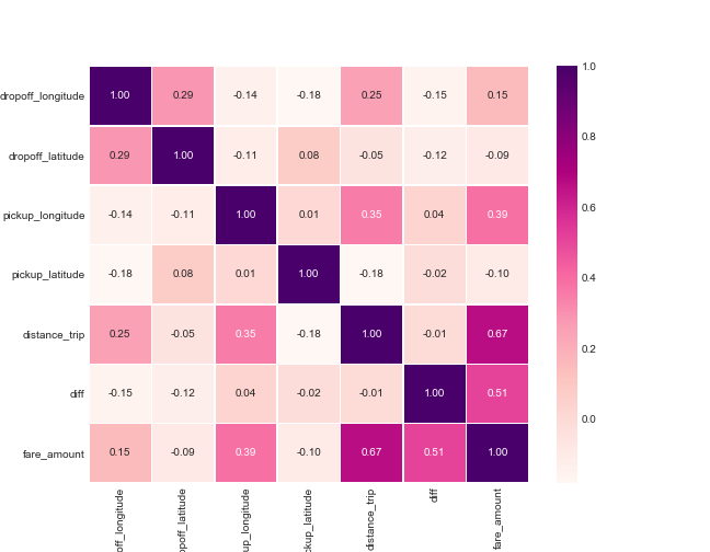
Step №4 - Plotting Heatmap
We countinue with correlations heatmap for numerical variables and find the highest rate is shown between distance and fare amount (same result calculated previously). For other variables correlation seems not significant.
Python code
# list numerical variables
numeric=['dropoff_longitude','dropoff_latitude', 'pickup_longitude', 'pickup_latitude',
        'distance_trip', 'diff', 'fare_amount']
"""
- compute correlation matrix
- plot heatmap annotated with color bar

"""
matrix = data[numeric].corr()
y, x = plt.subplots(figsize=(9, 7))

sns.heatmap(matrix, annot=True, fmt=".2f", linewidths=.5, cmap='RdPu')
plt.show()
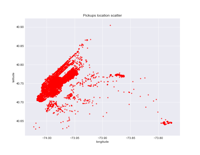
Step №5 - Pickups/dropoffs location
Additionaly we will build scatter plots to display the dense area for pickups and dropoffs. Besides we want to highlight the pickup points where fare amount flactuates over locations.
Python code
"""
- show the scatter based on pickups latitude/longitude

"""
fig, ax = plt.subplots(figsize=(9,7))

ax.scatter(sample['pickup_longitude'], sample['pickup_latitude'], s = 8, color = 'r', alpha = 0.65)


ax.set_title('Pickups location scatter')
ax.set_xlabel('longitude')
ax.set_ylabel('latitude')
Python code
"""
- show the scatter based on dropoffs latitude/longitude

"""
fig, ax = plt.subplots(figsize=(9,7))

ax.scatter(sample['dropoff_longitude'], sample['dropoff_latitude'], s = 8, color = 'b', alpha = 0.65)


# Label the axes and provide a title
ax.set_title('Dropoffs location scatter')
ax.set_xlabel('longitude')
ax.set_ylabel('latitude')
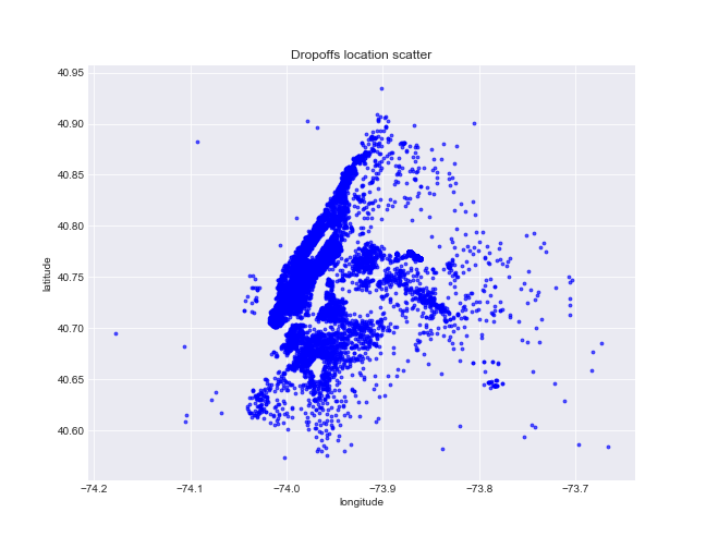
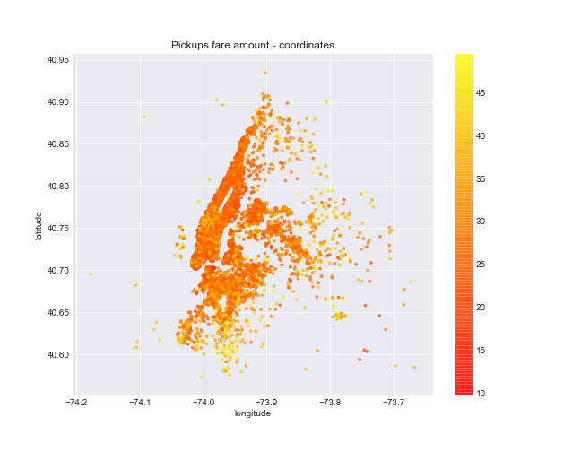
Chart shows highest density area approximately between -74.05, -73.05 in tems of longitude and 40.70, 40.85 latitudes. The fare amount varies over the scatter, but anyhow it tends to increase on the range from 40.55 to 40.65 latitudes.
Python code
"""
- use 'c' argument to add plot annotation,
- color bar shows gradation with respect of fare change

"""

fig, ax = plt.subplots(figsize=(9,7))

scatter = ax.scatter(sample['dropoff_longitude'], sample['dropoff_latitude'], c=sample['fare_amount'],
          s = 8, alpha = 0.65, cmap=plt.cm.autumn)
plt.colorbar(scatter)

ax.set_title('Pickups fare amount - coordinates')
ax.set_xlabel('longitude')
ax.set_ylabel('latitude')
To provide the interactive visibility we are going to map points using Mapbox tool and Plotly modules. In this case we need to access custom mapbox style with access token and style reference.
Python code
"""
- using go module to plot coordinates
- choose custom layout - NYC map with center point
- use iplot() modul to display the figure

"""
mapping = [go.Scattermapbox(
           lat= map_data['pickup_latitude'] ,
           lon= map_data['pickup_longitude'],
           mode='markers',
           marker=dict(
               size= 4,
               color = 'rgb(17, 157, 255)',
               opacity = 1.0
           ),
         )]
layout = go.Layout(autosize=False,
                  mapbox= dict(accesstoken=map_access_token,
                               bearing=10,
                               pitch=60,
                               zoom=12,
                               center= dict(
                                        lat=40.761,
                                        lon=-73.936),
                               style= "mapbox://styles/makarovartyom/cjqfhii65ipy92rojkbe0ucxr"),
                   width=900,
                   height=600,
                  title = "NYC Pickups locations")
fig = dict(data=mapping, layout=layout)
iplot(fig)
Python code
"""
- mapping for dropoffs using same layout

"""

mapping = [go.Scattermapbox(
           lat= map_data['dropoff_latitude'] ,
           lon= map_data['dropoff_longitude'],
           mode='markers',
           marker=dict(
               size= 4,
               color = 'rgb(215, 48, 39)',
               opacity = 1.0
           ),
         )]
layout = go.Layout(autosize=False,
                  mapbox= dict(accesstoken=map_access_token,
                               bearing=10,
                               pitch=60,
                               zoom=12,
                               center= dict(
                                        lat=40.761,
                                        lon=-73.936),
                               style= "mapbox://styles/makarovartyom/cjqfhii65ipy92rojkbe0ucxr",
                              ),
                   width=900,
                   height=600,
                  title = "NYC Dropoffs locations")
fig = dict(data=mapping, layout=layout)
plot(fig, filename='dropoffs', include_plotlyjs=False, output_type='div')
The busiest taxi traffic covers Manhattan district center and goes down across Brooklyn and Queens.
Now in this part of our project we are finishing with explanatory analysis and ready to build predictive model in the next one.